A favicon is approved at large size in an editor, but people meet it at 16 to 26 pixels in search results. I built a small HTML tool that previews icon variants inside a mock results page with your real competitors, and a Claude Code skill that builds the final files.
The problem
A favicon usually gets designed and approved at large size, in an editor, on a white or grey canvas. It looks fine there.
People meet it somewhere else: at 16 to 26 pixels in search results, in a column with nine other sites. What matters there is not how the icon looks alone. It is whether it stands out among its neighbours.
I built this tool for a project I work on as an SEO specialist and developer. The site needed a new favicon, and I wanted the choice to rest on how each candidate looks among the real competitors, not on taste. We chose the icon this way and agreed it with the business owner. The project stays unnamed for now, so the examples below use the demo set up for my own site.
What the tool is
It is one HTML file with no dependencies. You open it in a browser and see a mock search results page with the real competitors for your real queries; their favicons load by domain.
The panel on the right holds everything you compare: the query, your icon variants as tiles (the arrow keys flip through them too), where you look (Google on a phone, Google on desktop or Yandex) and your place in the results, anywhere from first to last. Below are four switches: all variants at once, squint (it blurs the page so only colour and shape are left), dark theme, and an outline around your own result.
On a wide screen the panel fades out while the mouse is not over it, so nothing distracts from the results.
Everything is configured in one CONFIG object at the top of the file. The interface is in Russian for now.
See it work
Sixteen seconds of the demo: flipping through variants with the arrow keys, switching between Google on a phone, Google on desktop and Yandex, moving my site from fifth place to first and back, dark theme, and all variants at once.
The tool in action (about 16 seconds, no sound).
A tour of the tool
The demo that ships with the tool is set up for my own site: two queries, the real first page of Google in Russia as of 12 October 2026, and twelve candidates (an M in different colours, a Р, code brackets, a magnifier, growing bars).
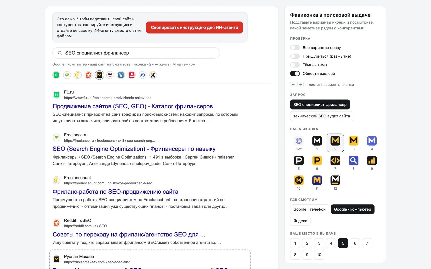
Google on desktop. The panel on the right: switches, the query, icon variants, where you look and your place in the results. The red button copies the setup instruction for your AI agent. 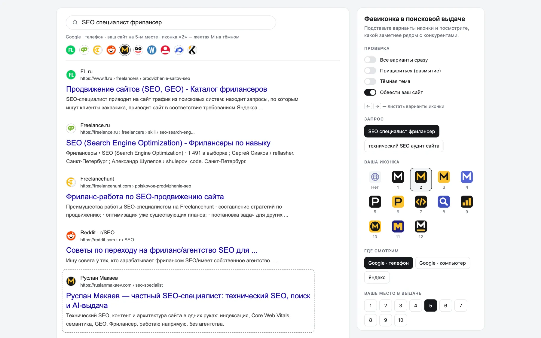
Google on a phone: the icon is cropped into a circle next to the site name. 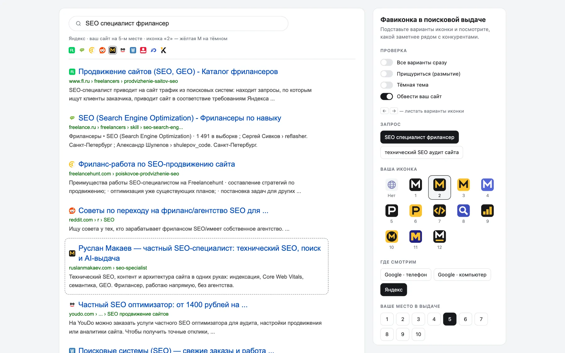
Yandex: a small square icon in front of the title. 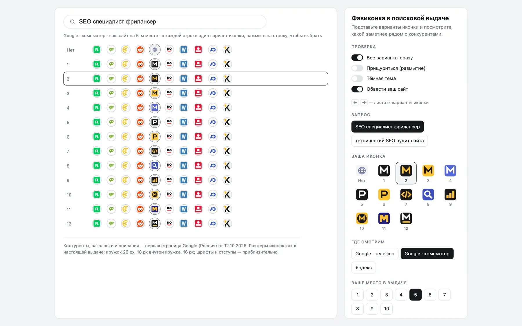
All variants at once: one row per candidate, the same neighbours in every row. Click a row to pick it. 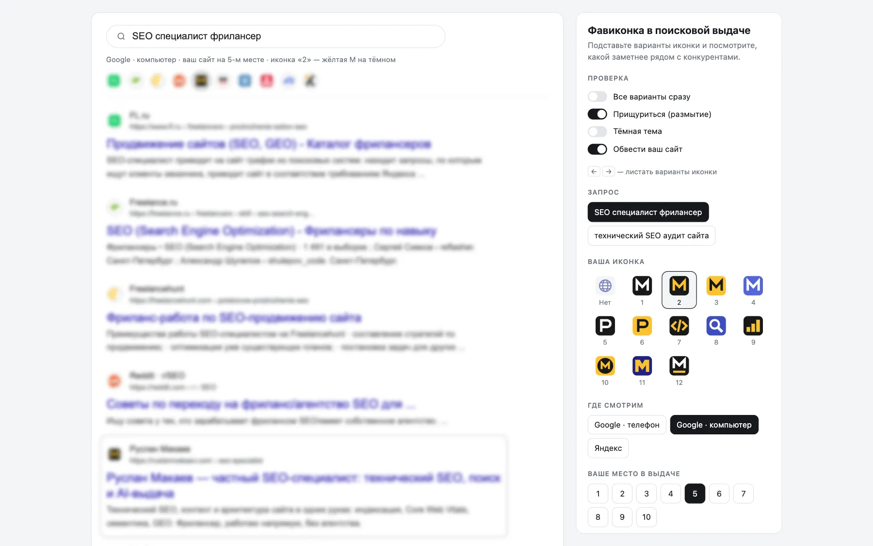
Squint: the page is blurred and only colour and shape are left. 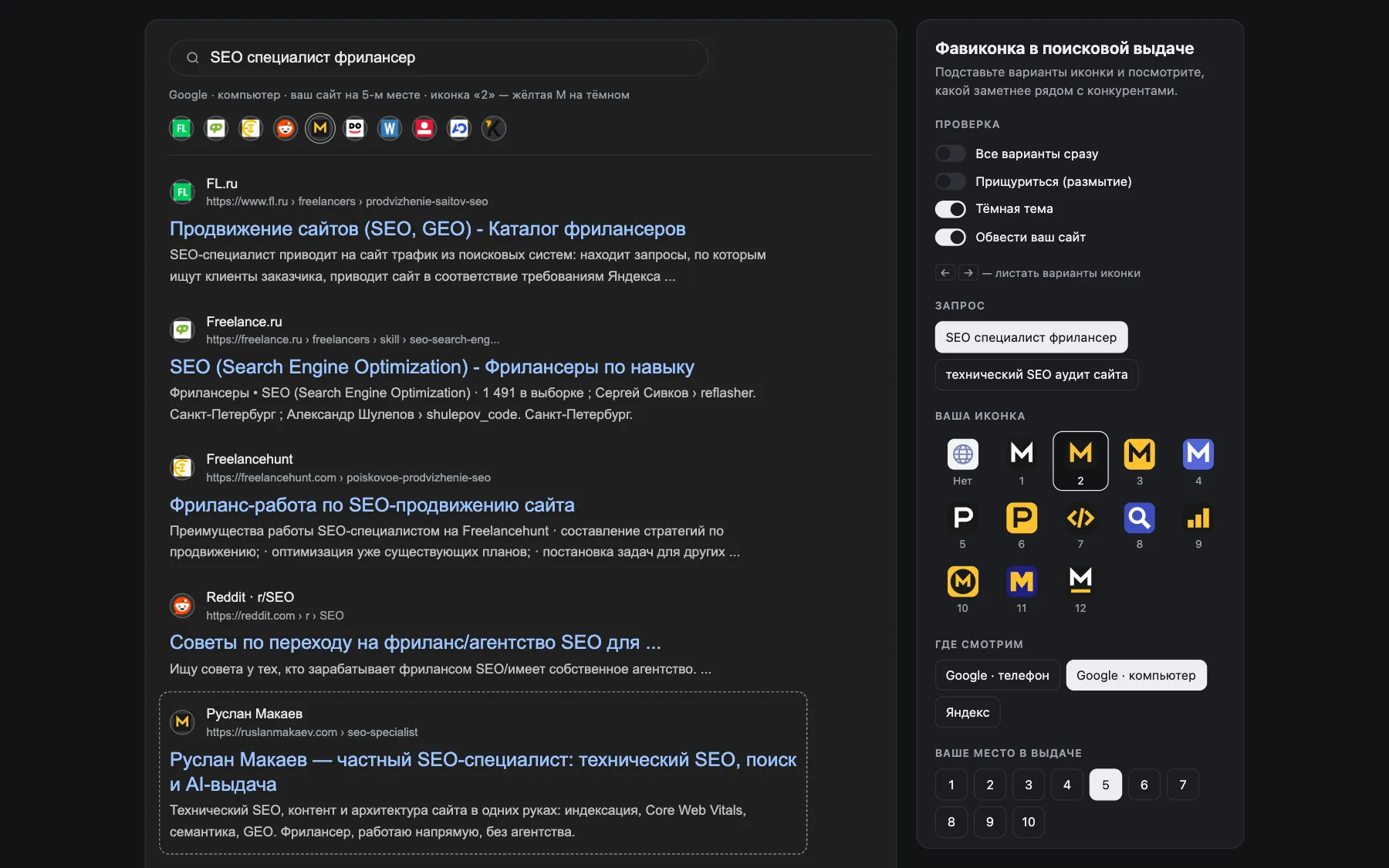
Dark theme: icons with a dark background lose their edge. Look at variants 1, 5, 9 and 12 in the panel, and at the black K in the results. 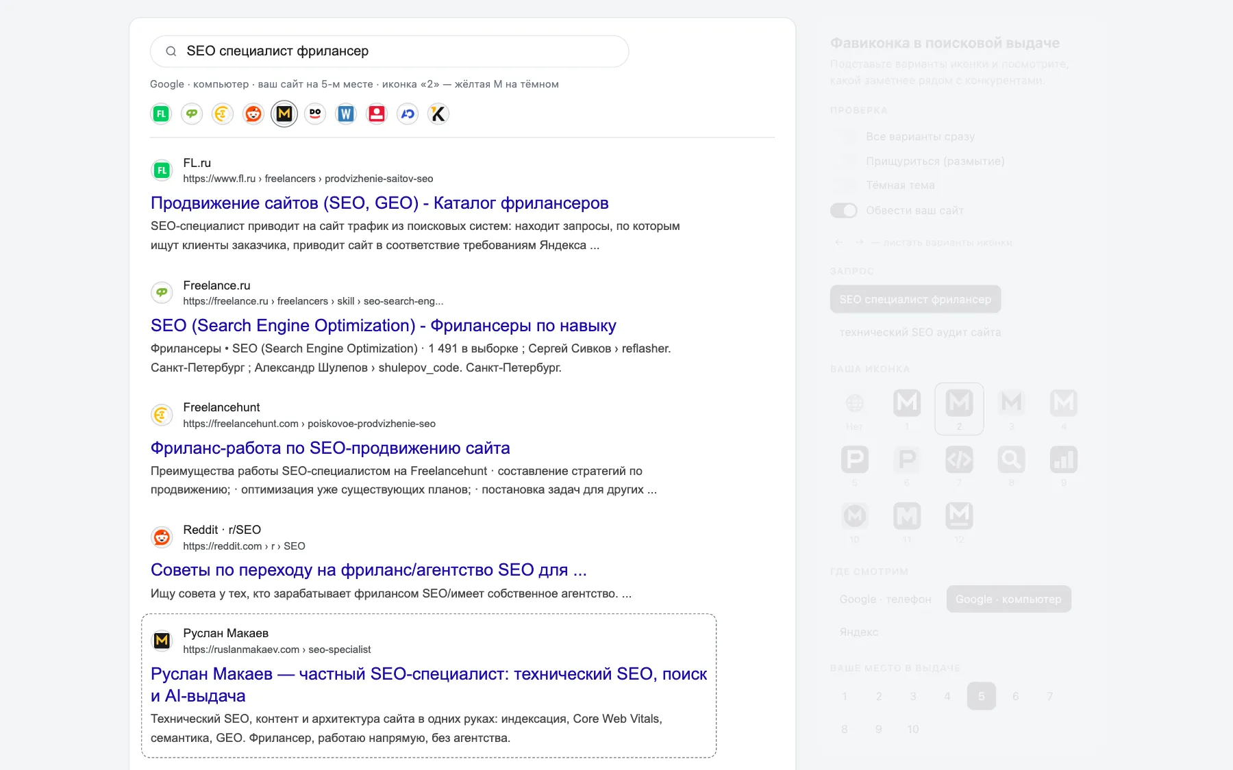
When the mouse leaves the panel, it fades out and leaves you with the results.
What it showed on my own site
For the query «SEO специалист фрилансер» (SEO freelancer) the neighbours are freelance marketplaces and a forum, mostly green, orange, red and blue. In place, the yellow M on dark has a problem you would not see in an editor: Freelancehunt, two results above, is yellow too. That is exactly the kind of thing I wanted to see before choosing, not after.
Rules I took away
- Google on a phone crops the icon into a 26 px circle, on desktop it shows 18 px inside a circle, and Yandex shows 16 px. Fill the background over the whole square and keep the mark in the centre.
- Use thick shapes and one or two colours. Small details turn into mud at 16 px.
- Pick a colour that none of your neighbours use. A contrasting pair, such as dark and yellow or white on a saturated colour, usually beats a mark on white.
- Check the result with "squint" and in dark theme.
Let your AI agent fill it in
The red button in the tool copies a step-by-step instruction for any coding agent: Claude Code, Codex, Cursor.
The agent asks for your domain and two or three main queries. It opens the real search results without personalization and records the first 7 to 10 organic results word for word. No ads, and no made-up competitors. If it hits a CAPTCHA, it asks you instead of bypassing it.
Then it draws 10 to 20 SVG variants by the rules above and fills in CONFIG. The choice stays with you.
The Claude Code skill
The kit also contains a skill. Copy the folder into your skills directory and ask Claude Code to "make a favicon for this site". It reads the stack of the project first and helps you pick the mark. Then it builds the full file set from one SVG: SVG, ICO with 16, 32 and 48, PNG 96 for Google, PNG 120 for Yandex, apple-touch 180, 192 and 512 icons, a maskable icon and a web manifest. It wires them in the way the framework expects (file conventions in Next.js, the public folder plus index.html in Vite, and so on) and tells you how to verify.
unzip favicon-serp-preview.zip
cp -r favicon-serp-preview/skill/favicon ~/.claude/skills/
# file generation needs sharp in the project: npm i -D sharp
Try it
What's next
The favicon is only one part of a search result. The next idea is the same preview for the whole snippet: you enter a query and your real competitors, then compare your title, description and rich snippets against theirs at your actual position, in Google and Yandex, to see what could raise your click-through rate. Brand awareness and position matter too, but this part you control. If you want it, write to me.